
EHR Design System
Atomic Design • Design Kit • Documentation • Enterprise • UX / Visual Design
Skills Used: Accessibility, Collaboration, Communication, Critical Thinking, Design Systems, Empathy, Figma, Interaction Design, Problem Solving, User-Centric Thinking, UX Design, Visual Design
Overview
NextGen's Enterprise Electronic Health Record (EHR) software suffered from outdated visual and interaction design, with inconsistent component behaviors and lack of intuitive design patterns creating confusion for users. Elements often masqueraded as different UI controls, such as buttons appearing as input boxes or dropdowns lacking visual cues.
To address these issues and enhance the overall user experience, the EHR team (comprised of a requirements engineer, developers, and clinical experts) sought the expertise of UX design and research to develop a comprehensive design system.
I want a design system to expedite the design process, allowing me to focus more on creative aspects and less on repetitive tasks.
— UX Designer, NextGen Healthcare


Primary Objectives
- Establish a cohesive visual language
- Satisfy clients' demands for an updated look and improved functionality
- Streamline the design and development processes, empowering designers to iterate rapidly and enabling developers to build new features more efficiently
Before & After Design System
Before
Outdated
Outdated visual design with inconsistent component styles.
Not Intuitive
Confusing interaction patterns and lack of intuitive UI controls.
Not Accessible
Non-compliance with accessibility standards.
Inefficient
Inefficient design and development workflows.
After
Intuitive & Accessible
Established a consistent, intuitive, and accessible visual language compliant with WCAG Level AA guidelines.
Cross-Functional Collaboration
Enabled seamless designer-developer collaboration with integrated documentation and coded component libraries.
Reduced Development Time
Significantly reduced development time for new components from 3 weeks to 1-3 days.
Accelerated Design Iterations
Achieved 50% faster design iteration and feature updates for designers.
Improved User Experience
Enhanced user experience for healthcare professionals with reduced clicks, improved information scan-ability, and optimized clinical workflows.
Solutions
As the UX designer on this project, I spearheaded the creation of a design system that encompassed typography, color palettes, iconography, and a comprehensive library of user interface components.
Partnering with a UX researcher, we ensured the design system was informed by user research, including interviews, usability testing, and feedback from stakeholders, including healthcare professionals, designers, and developers.
Key Principles & Guidelines
To ensure the design system's effectiveness and longevity, several key principles and guidelines were employed:

1. Accessibility
Prioritizing compliance with WCAG Level AA guidelines, including proper color contrast, zoom functionality, and keyboard focus states.

2. Consistency
Implementing a base-4 design system for consistent spacing and sizing of components, and defining primary, secondary, and tertiary styling patterns.

3. Usability
Incorporating feedback from healthcare professionals to ensure components were intuitive, scannable, and optimized for their workflow.

4. Flexibility
Designing modular and extensible components to accommodate future iterations and evolving user needs.

5. Collaboration
Facilitating seamless collaboration between designers and developers through comprehensive documentation and a shared component library.
Implementation & Impact
Phased Rollout
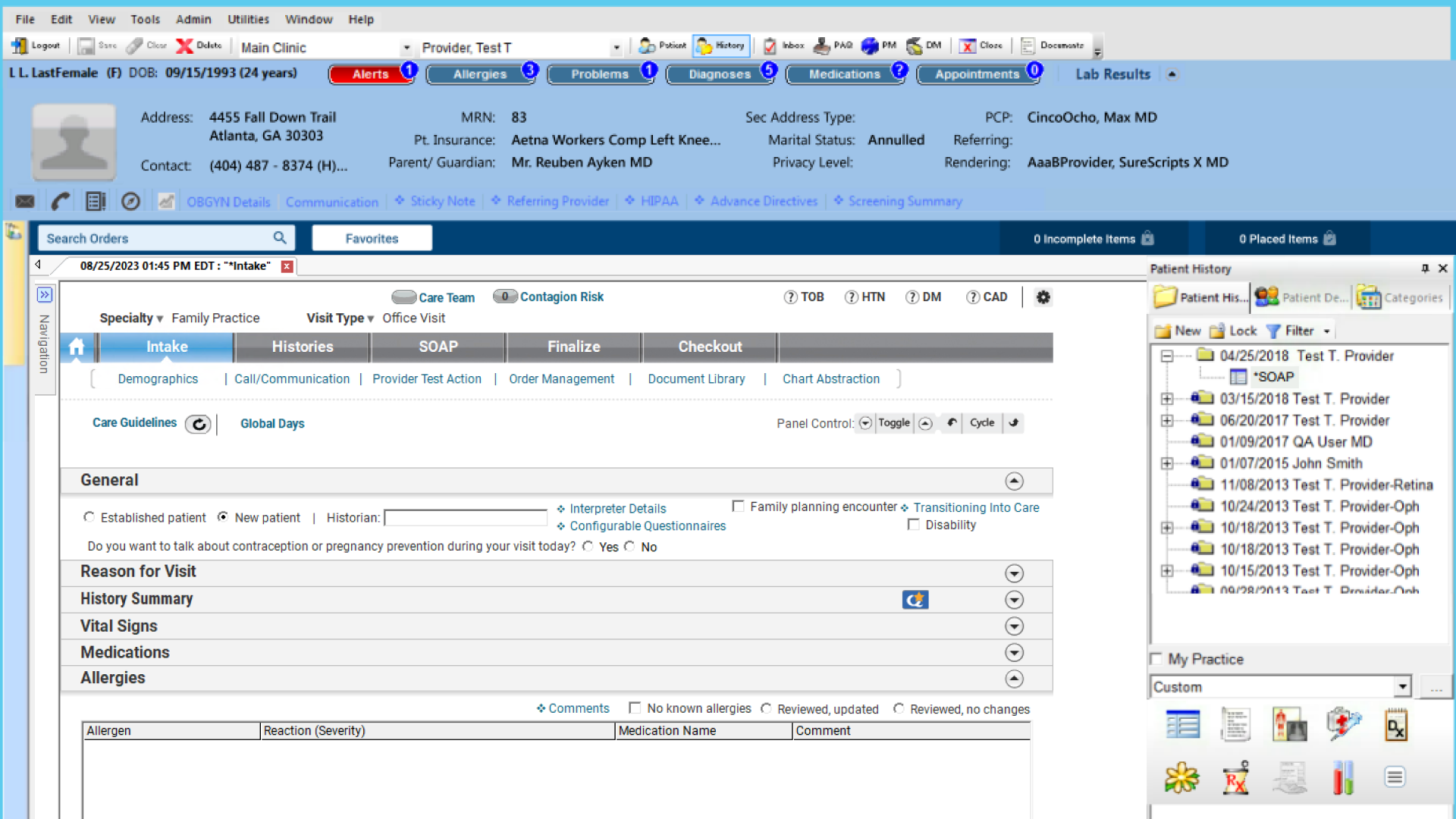
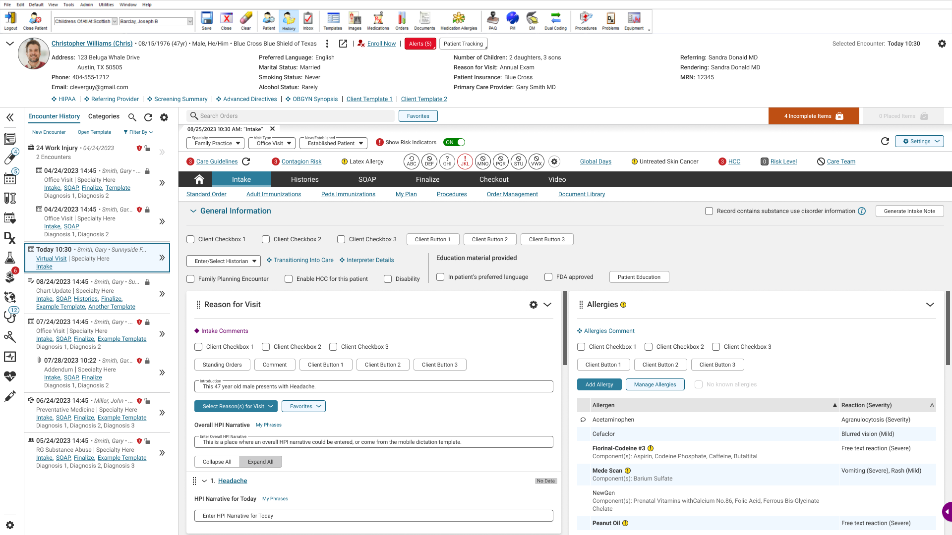
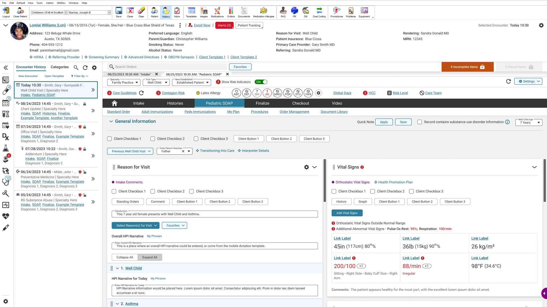
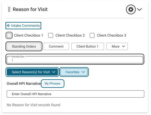
The design system was initially implemented across three critical templates within the Family Practice specialty: Intake, SOAP (Subjective, Objective, Assessment, Plan), and Pediatric SOAP.
This phased rollout approach allowed for iterative refinement and feedback before expanding to other specialties.
Intake Template
SOAP Template

Pediatric SOAP Template
Healthcare Professionals
Reduced Cognitive Load
Enhanced consistency and clarity of components, reducing cognitive load and improving learnability.
Streamlined Workflows
Streamlined workflows and better scan-ability of information.
Accessibility
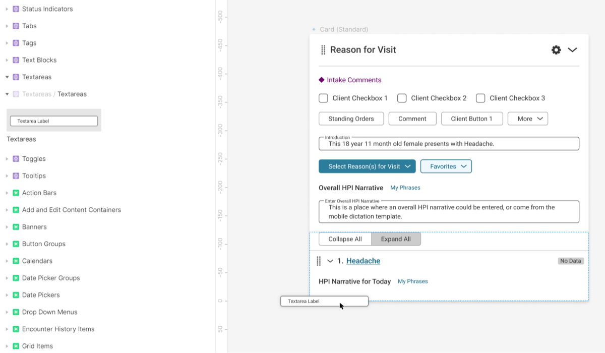
Improved accessibility through keyboard navigation, zoom functionality, and proper color contrast. The image showcases the accessible keyboard focus states and proper color contrast on various components.
Increased Efficiency

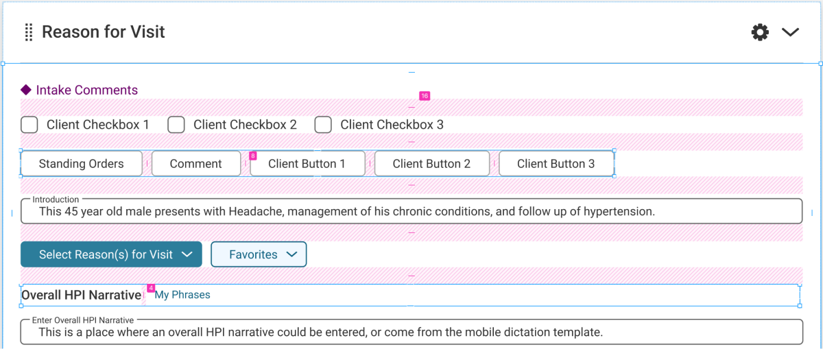
Reduced clicks and added direct editing capabilities, increasing efficiency. The majority of fields in the templates were made directly editable, eliminating the need for launching pop-ups and reducing unnecessary clicks.
Designers
Faster Iterations
The design system built in Figma facilitated faster design iterations and consistent organization, resulting in a 50% reduction in design time for new features and updates.
Developers
Reduced Development Time
A component library built by members of the development team using Windows Presentation Foundation (WPF) enabled efficient reuse of components. This integration significantly reduced development time for new components from 3 weeks to 1-3 days.
Documentation
Documentation allowed developers to better understand proper usage of specific components.
Design Process
The following structured process allowed us to create a flexible design system tailored to the complexities of the healthcare domain while meeting the unique needs of designers, developers and end-users.
I would like the design system to include a clear style guide, ensuring adherence to design principles.
— Developer, NextGen Healthcare
Discovery & Research
The process began with user research to understand the pain points and needs of all user groups - healthcare professionals, designers, and developers.
This Included:
- Workflow observations and interviews with healthcare professionals
- Interviews with designers and developers
- Technical constraints analysis with developers for WPF compatibility
Defining Components & Patterns
Atomic Design
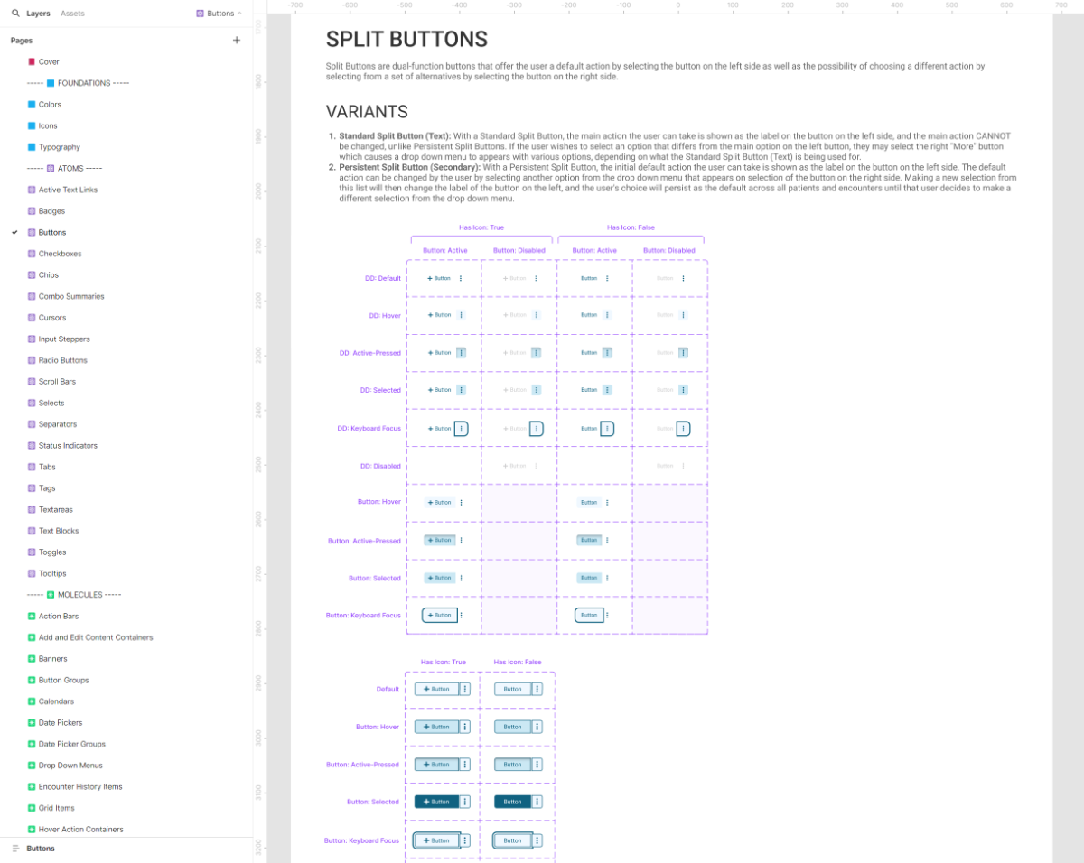
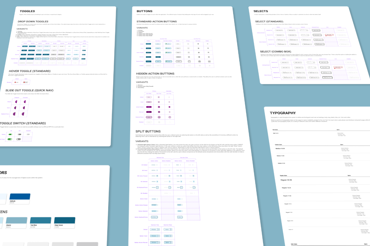
Leveraging Atomic Design methodology, the components were meticulously crafted in Figma, starting from the foundational elements and the atoms, and progressively building up to more complex compositions: molecules and organisms. This approach ensured a cohesive and scalable design system.
Design Kit Content
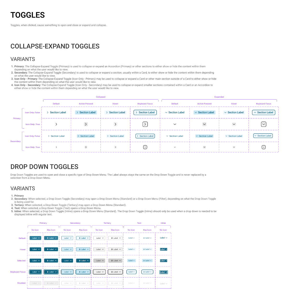
In the Design Kit file (a.k.a., a Figma Asset Library), components were given minimal documentation, as that was reserved for the main Design Documentation file. This file contained just enough information to delineate between components, and view their states and variants quickly in order to update more easily when needed.
Prototyping Interactions
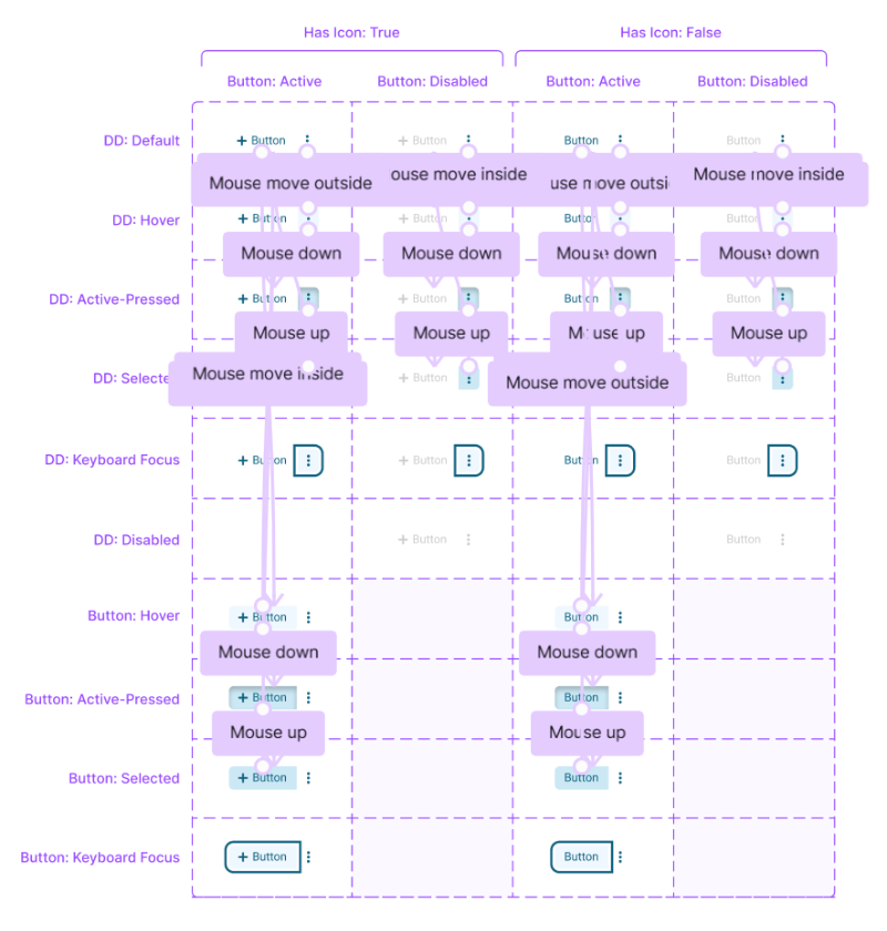
Basic interactions, such as mouse hover states, were added to each component in the Design Kit file. This allows designers to create more realistic prototypes much faster.
Design Documentation
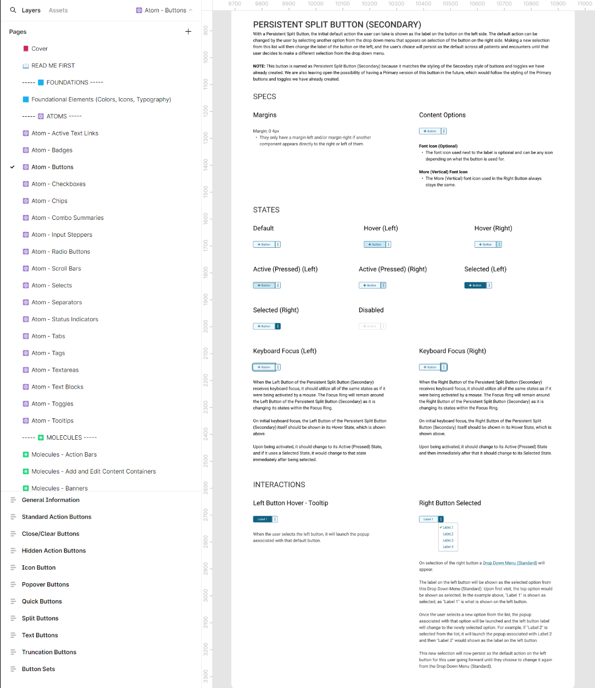
Documentation for each component was created directly within Figma, outlining its intended use, variants, and technical specifications.
Documentation "Read Me First"
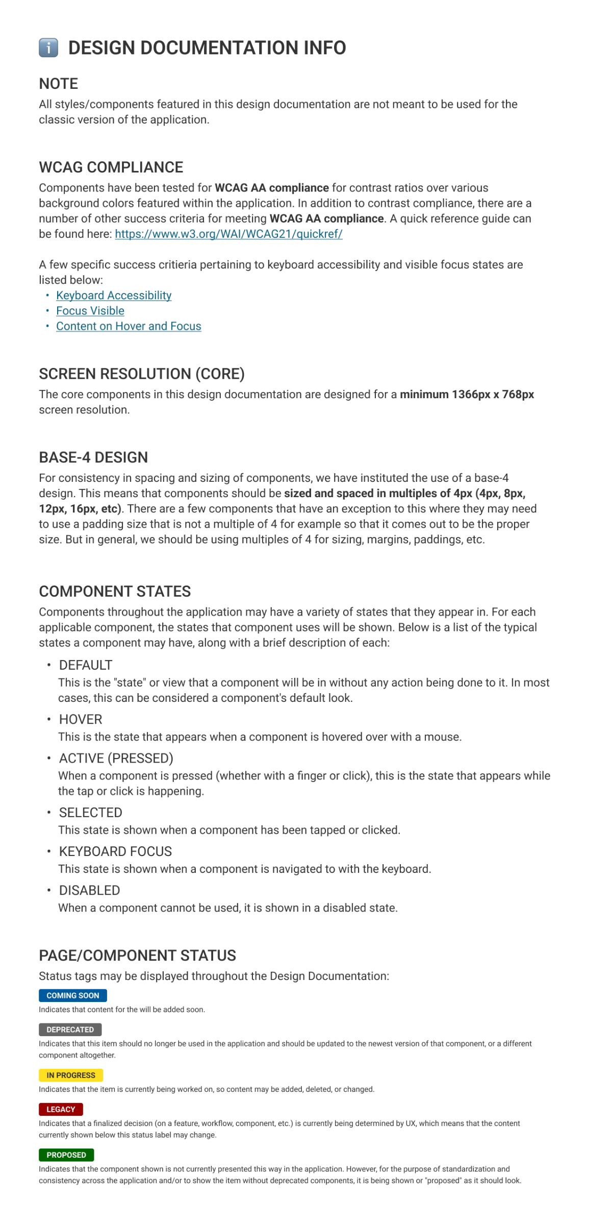
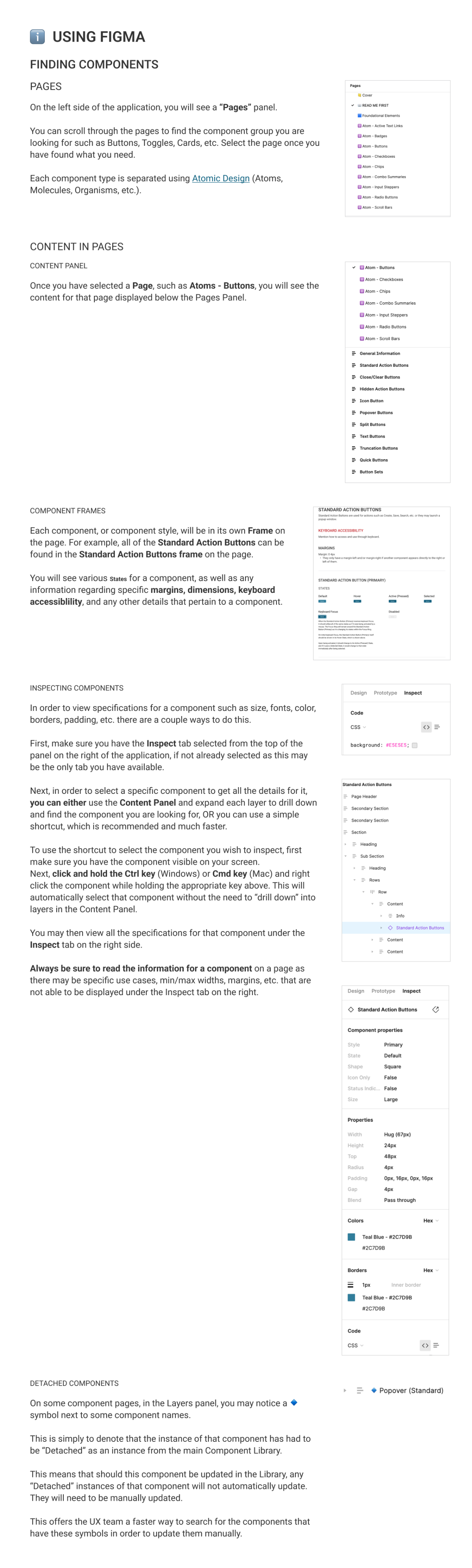
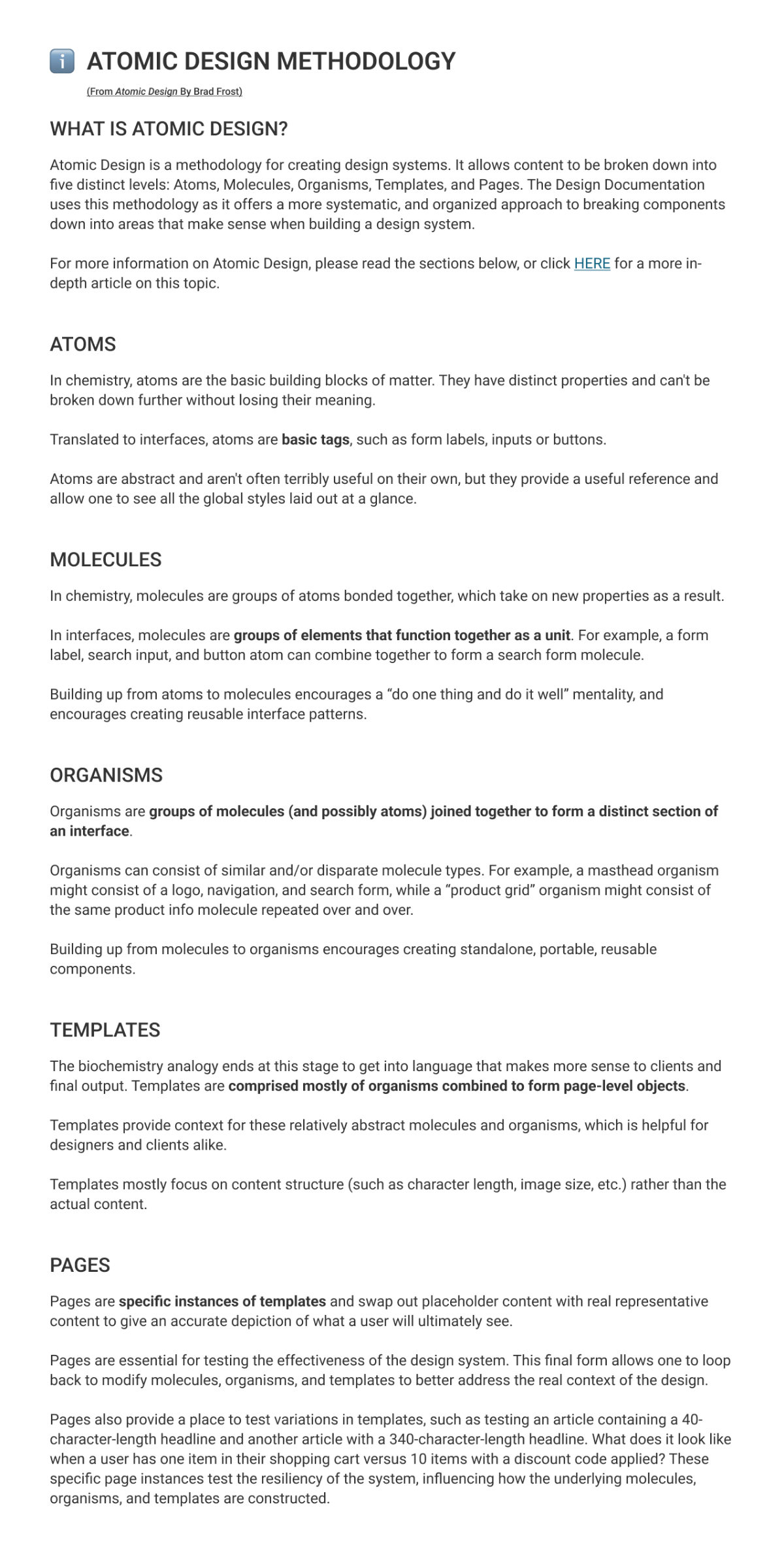
Within the Design Documentation file, I included a “Read Me First” page. This page contained information about the content contained within the file, how to use Figma and navigate through the file for those unfamiliar with it, and notes on Brad Frost’s Atomic Design Methodology.
This Page Contained:
- Information about the content contained within the file
- How to use Figma and navigate through the file (for those unfamiliar with it)
- Notes on Brad Frost’s Atomic Design Methodology
Documentation Links
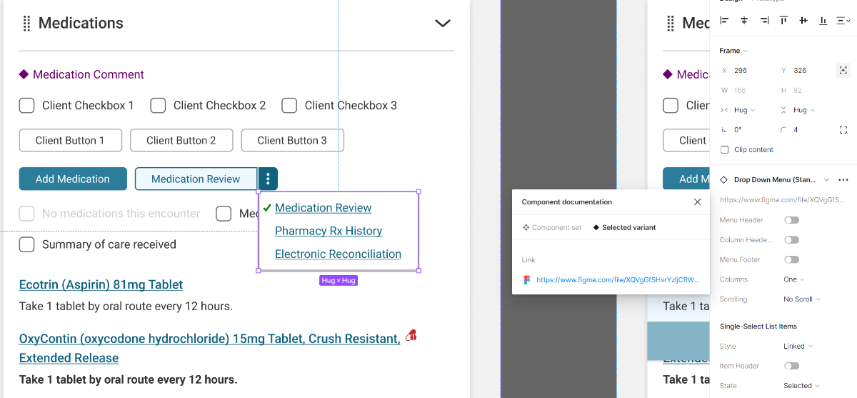
The component library in Figma linked each component directly to their respective section in the Design Documentation file, allowing designers and developers to easily access relevant information regardless of their current working file.
Accessibility & Consistency
Accessibility guidelines (WCAG Level AA) were followed, ensuring proper color contrast, zoom functionality, and keyboard navigation support. A base-4 design system was implemented for consistent spacing and sizing of components, with defined primary, secondary, and tertiary styling patterns.
Collaboration, Planning, & Refinement
Stakeholder Collaboration
Clinical stakeholder experts were consulted to ensure critical medical information was appropriately prioritized and conveyed through the design system's components.
Regular meetings with developers were held to ensure the proposed designs were technically feasible within the constraints of the WPF framework.
Implementation Planning
Worked closely with development to plan a phased rollout starting with high-impact templates.
Conducted prototyping and feasibility testing to validate planned patterns could be implemented within the WPF framework constraints.
Iterative Testing & Refinement
Iterative testing and refinement cycles were conducted, gathering feedback from users, designers, and developers.
This collaborative process ensured the design system met the needs of all stakeholders and remained consistent with industry best practices.
Conclusion
The design system project for NextGen EHR successfully implemented a cohesive, usable set of interface patterns that increased consistency and enhanced the user experience for doctors and staff.
While there were challenges working within technical constraints and driving full adoption, the positive impacts on design and development efficiency were significant.
Lessons & Insights
1. Buy-In & Adoption
While we did get buy-in and adoption from many developers, we didn't get it from everyone. Involving the engineering manager earlier in the process may have helped ensure the design system became a standardized part of the development workflow across all teams.
2. System Constraints
Updating NextGen's dated desktop application was not an easy task due to its complexity and technical constraints like WPF. Creative problem-solving was required to modernize the UX while working within those boundaries.
3. Accessibility Focus
This project helped increase my passion for inclusive design. Working to meet strict WCAG Level AA guidelines reinforced the importance of accessibility, especially for specialized applications used by a diverse range of users.
4. Continuous Collaboration
Continuous collaboration with stakeholders, including clinical experts, developers, and end-users, is essential for creating a design system that meets the unique requirements of the healthcare domain.